Tuesday, July 29, 2008

Image Critique #5

This weeks image is a little bit different from past weeks as it is more of a stylized fashion shot. As with all genres of photography, there are certain aesthetic aspects that are inherent to fashion photography that may or may not apply to other types of work.

Photo Critique by Scott Bulger


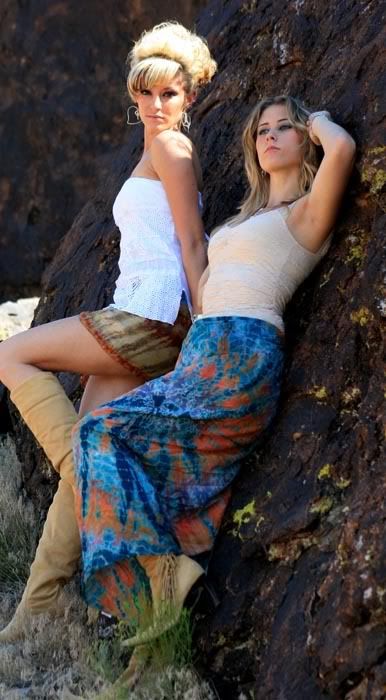
There are a lot of good things in this image that aren't easy to do. The models look comfortable and the contrast in their interaction and relationship is good. There is a great diagonal composition here that offers a lot of dynamism to subjects that aren't moving at all.

These are great models you have here. They seem easygoing and comfortable in front of the camera. Hopefully, you can continue to work together.

The issues that I see are, for the most point, small and easily correctable.

1. I'm not keen on the aspect ratio. You have cropped this into an unorthodox proportion that leads me to believe that you are hiding something that you didn't see when you were composing.

2. Whether it is due to this cropping or not, the toe and the knee of the model on the left are clipped by the edge of the frame. Don't amputate body parts with the edge of the frame.

3. There is a plant in front of the foot of the model on the right. If this is a "fashion" shot, pull that thing out or move the girls. Tough to buy a sell if you can't see it.

4. The hair of the model on the left is blown out from the highlight of the sun. You did a good job putting the models in nice bright shade. If you had moved them over another foot to the right, you could have eliminated this issue (as well as the hot spot above her knee). I like the light on her shoulder and face, but the hair is too hot. It's lost all detail in that spot. If you want to keep that highlight, a small diffuser in the path of the sunlight might tone it down just enough for you to retain detail there while keeping the highlight. An assistant here would be invaluable.

5. Pay close attention to the hands. The two hands that are in between the girls are cut off. Not seeing the right hand of the girl on the left isn't such a big deal to me because of her angle, but look for someplace to put the two hands in the middle so that they are visible.


Bottom Line: This is really a very good effort and with just a few minor teaks would be a very nice image. This line of photography is definitely something you could pursue.

Tuesday, July 22, 2008

Image Critique #4

Todays image was submitted by an on-line retailer that goes by the name WaterRose, who has a shop on Etsy.com, which is a collection of artisans that sell their hand made goods. Product photography is a huge deal for these retailers. When a potential customer cannot pick something up in their hands and hold it, feel it, and examine it, the photograph becomes your main selling point. Typically, a photograph is only selling itself, but in this circumstance, the photograph is responsible for selling what is "in" the photograph.

Here is the image that WaterRose submitted:

WaterRose

The first thing I want to talk about is the background. While I'm not opposed to text as a background for this type of photo, I think I would like it just a little more out of focus so the viewer isn't trying to read it. You really want them concentrating on the product here. I would also slide the book all the way to the top of the frame so:

A. The cuff doesn't break the plane of the edge of the book (think about a portrait and how the nose shouldn't break the plane of the face)

and

B. There isn't a gap between the top of the book and the edge of the frame, adding another element to the image that is unnecessary.

The image appears to have an overall green caste to it, which in an "art" image, could be intentional, but in a product image, you should be rendering the image as close to reality as you can get it. Maybe this adjusted image is closer, and maybe it's not, but I think it would be.

Photobucket


I feel like the main piece in the image is a bit distorted due to the close proximity of the lens to the subject. For this particular shot, I think I would back up a little bit and use a longer lens to compress the image and reduce the distortion of the cuff.

I would give it (the cuff) just a little more room around the edges, letting it "breathe" and reducing the amount of "tension" created by the amputations. In many circumstances, tension in an image can be a good thing, but when dealing with a product, I'm not sure that it is such a good idea.

You've filled the frame with your product, and that is a very good thing. Nobody will be mistaken as to what you are highlighting here. The lighting is also very nice, and lighting is no easy trick.

Bottom Line: It's a nice job and only needs a few tweaks to be really very good. If you can't adjust the color of your image after the fact, make sure that you are using the proper white balance. If you don't have a longer lens, just back up. Since this is a product shot for the web, it's only going to be 72DPI and fairly small overall, so making a moderate crop to get it to where you want it to be isn't a big deal.


Submissions for critique are always accepted. Attach your image to an email that says "Image Critique" in the subject line and I will get to it. Keep shooting.


Monday, July 21, 2008

Anatomy of a Piano

A piano is surely the most amazing instrument to me. The variety of sounds that can be created by someone that is skilled in its use just amazes me. A piano can sound like rain, or it can sound like wind, in the hands of a master. The virtuoso can convey the deepest of emotions, and bring a listener to unparalleled highs and lows. One of the very few things in my life that I wish I could do, yet cannot, is play the piano.

A piano is also a beautiful physical structure, both from the outside, and on the inside. It was with this in mind, that I approached the rotting carcass of a piano that I came upon being used as an avant-garde landscape decoration. I have been back to photograph it three times before finally being happy with these two images.


Anatomy of a Piano 1
"Anatomy of a Piano 1"

Anatomy of a Piano 2
"Anatomy of a Piano 2"

Wednesday, July 16, 2008

Image Critique #3

This is a tough one to talk about because I'm sure it is an emotional image to both the photographer and to the people it was done for. I'm sure that the parents of this image really loved it.


It appears that this was a spur of the moment idea that grew from a seed while doing a portrait shoot for this newly adopted child, that arrived while her new father was serving his third tour of duty in Iraq. I say that because, while I like the idea and can see the vision, there are quite a few little things that really turn me off as a non-attached viewer of this photograph.

These are in the order that I noticed them. Whether that carries any importance or not is up to you to decide.

1. Grab an iron. Iron the flag. It looks like it just came out of the package and the creases really stand out.

2. The flag is not parallel to the focal plane of the camera, causing the lines to converge. They aren't parallel to the edges of the frame.

3. I don't like the way the flag bleeds past the edges of the frame. Partial stars sticking into the frame and half a stripe on the right hand side, and a missing stripe on the left hand side are distracting at the least.

4. The toe of the bag that the child is in sticks into the blue field of stars.

5. This one is last; the baby in the bag kind of gives me the creeps.

Good Things

1. The lighting is very nice. Soft and even.

2. The colors are very nicely rendered. I might brighten the white just a bit, but it is certainly very nice as it is.

3. I'm sure that the parents loved it, and that is important.

What I would suggest:

Forgive my clumsy cutting and pasting, but believe me, this looks better than my clumsy cloning did.


Keeping the child in the bag, I would include the entire field of stars on the left and eliminate the partial stripes that were beneath it. Include all the stripes on the right. This balances the background. You can see how my "nicely ironed" flag looks much cleaner. Make sure that the flag is completely parallel with the focal plane of the camera to make sure that none of the lines are converging. I would also raise the child up, so that she was mostly above the horizontal center line, effectively splitting this image into three parts. make sure you keep her toes out of the blue.

There is a lot of symbolism in this image, and symbolism is always open to interpretation. I think I would have laid the flag down flat and let the child lay on it, wrapping it gently over her body to symbolize the way that she would be protected and comforted. In this presentation, with the flag behind and the child in a bag (constrained), I get a sense of foreboding and doom, like the overwhelming power of the flag (government) is hovering over her.

Bottom Line: Good idea that I'm sure the parents loved. My nit-pickiness is only to help you think of these things in the future. Take your time and prepare. Don't rush. Symbolically, my interpretation is just that, only my interpretation and feeling. Others, including the parents and you might just as accurately feel differently, and since it really isn't an image for public display, the interpretation of the parents is the one that matters here. But don't discount the compositional and preparational issues just because the parents like it. This is where you will really shine.


Friday, July 11, 2008

Image Critique #2

Everyone like flowers, well, not everyone, but they certainly are a very popular subject for training your lens. Getting a good shot of a flower is not as easy as the good floral photographers make it look.

Lets look at this image that was submitted.


OK.... Let's talk about focus and depth of field. There is very little depth of field in this image. Almost none. The only part of the frame that is in focus, is the greenery in the background and the very back edge of the bloom. If you are only going to have one part of your image in focus, this isn't what you want. You would want the focus to be in the front, where people are going to see it first and concentrate on that.

There is a large blurry stamen (if my botanical biology isn't up to snuff and that isn't what you call that thing, I'm sure someone will let me know. But hey, I'm a photographer, not a horticultural expert.), sticking out from the middle of the photograph that just gets in my way everywhere that I try to look. BAM! there it is again! BAM! BAM! This blurriness is caused by being out of focus, not from camera shake. You can tell that because parts of the photograph in the way back are very sharp. If the camera was moving, it would have blurred everything.


The third thing is the lighting. Strange and flat. It looks like flash, but I can't swear to it. Direct, on camera flash, is very difficult to use in this type of situation. You have to at least bounce it or diffuse it if you think it is necessary. If it's a P&S, turn the flash off.

I'm going to take a guess and say that this was a small part of a much larger image. I don't see another explanation for how the point of focus could be this far off unless it was intentional and I don't think it was intentional.

To do this shot right, you need a tripod and natural diffused light. A hazy day or early in the morning/early in the evening will work the best. You need good depth of field which you will get from shooting somewhere between f8 and f11, maybe even smaller if necessary, depending on your lens and how close you are to the subject. This might cause your shutter speed to be longer than it should be for you to hand hold it (see previous blog post), so use your tripod and either a shutter cable or a timer to avoid camera shake.

I hope the submitter of this image will tell me if I'm right about the extreme crop and flash.

Bottom line: You can do better than this.


If you have an image you would like critiqued (after these last couple I think my supply might dry up), please email it to me as specified in this post.

Wednesday, July 9, 2008

Ooooooh, your camera takes such nice sharp photos......

No, it doesn't. My camera is a tool and it does what I tell it to do. Your camera should do what you tell it to do too.


You need to provide your camera with the proper tools to get it to do what you need it to do for you.

The two things that will provide you with a sharper image are:

1. A tripod, preferably, a good tripod.

This is the most under rated piece of photography equipment there is. The single biggest difference between a "snapshot" and a "photograph" is the use of a tripod. You can lean on a tree, hold your breath, or glue the camera to your forehead, but none of this will improve your steadiness and the sharpness of your image like a tripod will. The rule of thumb is (please, no comments about the origins of "the rule of thumb") that your shutter speed should be at least equal to, if not faster than the focal length of your lens. If you are using a 100mm lens, then your shutter speed should be at least 1/125th of a second. If you are using a 200mm lens, then 1/250th of a second is the slowest acceptable shutter speed to hand hold your camera. Even at these speeds, a tripod will improve your image sharpness. A tripod will always improve your image sharpness, and there are circumstances where getting any kind of shot will be impossible without one.

"But I don't like lugging around a tripod."

So don't. Just understand that your images are not as sharp as they could be if you did, so don't be surprised when your shots are not as sharp as they could be, and you see sharper images elsewhere. Refusing to use a tripod is crippling your photo taking ability.


2. Good glass (lenses)


Imagine spending $1000 on a stereo system for your car or your home and hooking up $49 speakers to it. What's it going to sound like? It's going to sound like a $49 stereo system. Cheap speakers create cheap sound.

It's the same with cameras. Cheap lenses (including the cheap zoom "kit" lenses that come with most DSLR's) produce images with less sharpness, detail, and contrast, than their more expensive brethren.

Prime (fixed focal length) lenses have been the route to go, offering much better optics and apertures than the cheap zooms, but now, there are some very nice zoom lenses available that will give you excellent quality as well. There are too many options and systems available to make any specific recommendations, but do your homework. There is a reason why the Nikon 70-300 f4.5-5.6 can be had for $109 and the Nikon 18-200 3.5-5.6 ED IF AF-S DX VR is $679 and the Nikon 70-200 2.8 AF-S VR ED IF is $1,600. All lenses are not created equal.

I understand that everyone is not financially able to spend $1600 on a lens, but there are always many levels in between. There are a couple of very good third party lens manufacturers (Tamron and Sigma) that can also be options.


Tuesday, July 8, 2008

Image Critique #1

Now that the long holiday weekend is behind us here in the states, it's time to get back to business. This is the first submission that I received to my call for volunteers, (there have been many and I will get to all of you, even if I have to pick up the pace) so here it is.

Here is the first image submitted:


While I certainly see the attraction to the subject, there are a couple of things that definitely need attention. Compositionally, the subject is kind of stuck in "no man's land", meaning that it is too far away to get any of the real detail in the structure, and it is too close to put it in perspective. There is nothing else in the frame to give it any scale. Either move in and really concentrate on the detail, or back up and make it the focal point of a larger image.

For the most part, I stuck with the composition as it was presented to me, I obviously couldn't make the road trip to rephotograph the image. What I did do, was give it just a slight crop, which moved the image just slightly off center (Using the center post as the main focal point) and gave the image a 2 degree rotation clockwise to better orient it. While both of these changes are subtle, they make a huge difference in the composition.

The image was also very flat and washed out, having little tonal range. I spent about two minutes adjusting the levels, and doing a little dodging and burning. I think you'll agree that the resulting image has much more impact than the original. There is still a hot spot in the lower left corner that you could get rid of with a little cloning, but I didn't want to take this that far.

Bottom line: I like the idea and it has good potential, but the execution and presentation were lacking. Keep it up though, practice will help you more clearly express what you are seeing in your minds eye.


Submissions for critique are always accepted. Attach your image to an email that says "Image Critique" in the subject line and I will get to it. Keep shooting.