Image Critique #4
Todays image was submitted by an on-line retailer that goes by the name WaterRose, who has a shop on Etsy.com, which is a collection of artisans that sell their hand made goods. Product photography is a huge deal for these retailers. When a potential customer cannot pick something up in their hands and hold it, feel it, and examine it, the photograph becomes your main selling point. Typically, a photograph is only selling itself, but in this circumstance, the photograph is responsible for selling what is "in" the photograph.
Here is the image that WaterRose submitted:
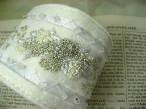
The first thing I want to talk about is the background. While I'm not opposed to text as a background for this type of photo, I think I would like it just a little more out of focus so the viewer isn't trying to read it. You really want them concentrating on the product here. I would also slide the book all the way to the top of the frame so:
A. The cuff doesn't break the plane of the edge of the book (think about a portrait and how the nose shouldn't break the plane of the face)
and
B. There isn't a gap between the top of the book and the edge of the frame, adding another element to the image that is unnecessary.
The image appears to have an overall green caste to it, which in an "art" image, could be intentional, but in a product image, you should be rendering the image as close to reality as you can get it. Maybe this adjusted image is closer, and maybe it's not, but I think it would be.
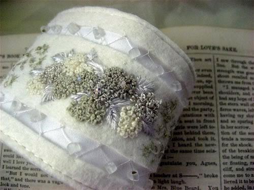
I feel like the main piece in the image is a bit distorted due to the close proximity of the lens to the subject. For this particular shot, I think I would back up a little bit and use a longer lens to compress the image and reduce the distortion of the cuff.
I would give it (the cuff) just a little more room around the edges, letting it "breathe" and reducing the amount of "tension" created by the amputations. In many circumstances, tension in an image can be a good thing, but when dealing with a product, I'm not sure that it is such a good idea.
You've filled the frame with your product, and that is a very good thing. Nobody will be mistaken as to what you are highlighting here. The lighting is also very nice, and lighting is no easy trick.
Bottom Line: It's a nice job and only needs a few tweaks to be really very good. If you can't adjust the color of your image after the fact, make sure that you are using the proper white balance. If you don't have a longer lens, just back up. Since this is a product shot for the web, it's only going to be 72DPI and fairly small overall, so making a moderate crop to get it to where you want it to be isn't a big deal.
Submissions for critique are always accepted. Attach your image to an email that says "Image Critique" in the subject line and I will get to it. Keep shooting.
Here is the image that WaterRose submitted:
The first thing I want to talk about is the background. While I'm not opposed to text as a background for this type of photo, I think I would like it just a little more out of focus so the viewer isn't trying to read it. You really want them concentrating on the product here. I would also slide the book all the way to the top of the frame so:
A. The cuff doesn't break the plane of the edge of the book (think about a portrait and how the nose shouldn't break the plane of the face)
and
B. There isn't a gap between the top of the book and the edge of the frame, adding another element to the image that is unnecessary.
The image appears to have an overall green caste to it, which in an "art" image, could be intentional, but in a product image, you should be rendering the image as close to reality as you can get it. Maybe this adjusted image is closer, and maybe it's not, but I think it would be.
I feel like the main piece in the image is a bit distorted due to the close proximity of the lens to the subject. For this particular shot, I think I would back up a little bit and use a longer lens to compress the image and reduce the distortion of the cuff.
I would give it (the cuff) just a little more room around the edges, letting it "breathe" and reducing the amount of "tension" created by the amputations. In many circumstances, tension in an image can be a good thing, but when dealing with a product, I'm not sure that it is such a good idea.
You've filled the frame with your product, and that is a very good thing. Nobody will be mistaken as to what you are highlighting here. The lighting is also very nice, and lighting is no easy trick.
Bottom Line: It's a nice job and only needs a few tweaks to be really very good. If you can't adjust the color of your image after the fact, make sure that you are using the proper white balance. If you don't have a longer lens, just back up. Since this is a product shot for the web, it's only going to be 72DPI and fairly small overall, so making a moderate crop to get it to where you want it to be isn't a big deal.
Submissions for critique are always accepted. Attach your image to an email that says "Image Critique" in the subject line and I will get to it. Keep shooting.