Image Critique #6
Hello again. It's time for image critique #6. Thanks for following along.
Todays image was submitted by Pam. Thanks Pam.
Todays image was submitted by Pam. Thanks Pam.
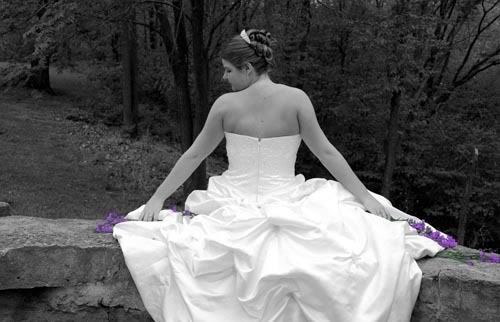
I'm going to start off small and work up. This isn't a bad image, but there are a few simple things that would improve it immensely.
1. Posture. The subjects spine is tipped to the right and her shoulders are tipped to the left. This is important because the back is so prominent in the composition. It looks a little awkward and not very comfortable. This is more than likely caused by the subject sitting on a sloped wall, throwing off her balance. I'd like to see the chin up just a little bit higher as well.
2. Eyes. I'd like to see more eye here. The way her head is positioned, she might me looking down, or her eye might be closed. It's tough to tell. If the eyes are in the frame, you should be able to tell what they are doing.
3. Selective Coloration. I'm not going to make any bones about it, I don't like selective coloring. I think it's dated and gimmicky. Selective coloring first made it into the popular mainstream in the 80's with those cute little kids in the overalls on the swingset with the 5 year old boy giving the 5 year old girl a cute flower. Given that, I can tell when it accomplishes what it is supposed to do, and this doesn't do that. Coloring the flowers at the end of the brides arms draws the viewers attention away from what you should be trying to get them to look at, and that's the bride. I can't think of a single situation where this technique would be compositionally appropriate. People that like it, tend to like it because it's "different" and they haven't seen it before. Once they see it a few times, it becomes old hat. So even if a client "wants" it, they probably aren't going to think it's so unique 20 years from now when they have gone through their wedding photos 100 times..
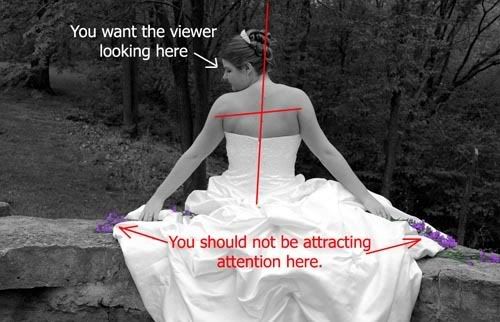
1. Posture. The subjects spine is tipped to the right and her shoulders are tipped to the left. This is important because the back is so prominent in the composition. It looks a little awkward and not very comfortable. This is more than likely caused by the subject sitting on a sloped wall, throwing off her balance. I'd like to see the chin up just a little bit higher as well.
2. Eyes. I'd like to see more eye here. The way her head is positioned, she might me looking down, or her eye might be closed. It's tough to tell. If the eyes are in the frame, you should be able to tell what they are doing.
3. Selective Coloration. I'm not going to make any bones about it, I don't like selective coloring. I think it's dated and gimmicky. Selective coloring first made it into the popular mainstream in the 80's with those cute little kids in the overalls on the swingset with the 5 year old boy giving the 5 year old girl a cute flower. Given that, I can tell when it accomplishes what it is supposed to do, and this doesn't do that. Coloring the flowers at the end of the brides arms draws the viewers attention away from what you should be trying to get them to look at, and that's the bride. I can't think of a single situation where this technique would be compositionally appropriate. People that like it, tend to like it because it's "different" and they haven't seen it before. Once they see it a few times, it becomes old hat. So even if a client "wants" it, they probably aren't going to think it's so unique 20 years from now when they have gone through their wedding photos 100 times..
If you must use this technique, try to use the color to attract the viewers eyes to where you want them to look.
4. Contrast and Tonal Range. This is an extremely contrasty image and must be handled carefully. As seen in the histogram below, there are very few mid-tones here.
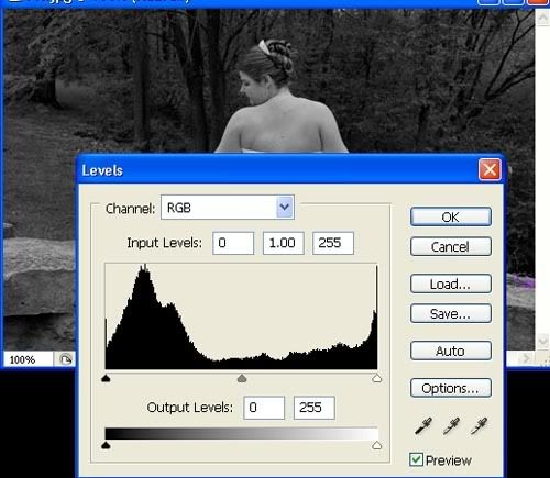
Try to balance the image a little better using more of the available tonal range. Also, watch out for the bright spots. When dealing with wedding dresses, this can be very tricky. You want the dress to be white, but not so white that you can't see any detail. There are chunks of the dress that are to bright.
5. Depth of Field. A little less Depth of Field would have been helpful here, allowing the background to be lighter without all of the trees and branches being a distraction. I'm not talking about a lot lighter, just a little, stretching out that low end of the histogram. Treat this as a portrait, and open up your aperture.
Since we are talking about Histograms, just let me say that there are no "good" or "bad" histograms. They merely provide us with information and allow us to illustrate something that can sometimes be difficult to explain.
Bottom Line: This image is OK, but a few minor alterations while shooting could have really perked it up. The client might like it, and that is great, but it's not an image that will stand the test of time.
4. Contrast and Tonal Range. This is an extremely contrasty image and must be handled carefully. As seen in the histogram below, there are very few mid-tones here.
Try to balance the image a little better using more of the available tonal range. Also, watch out for the bright spots. When dealing with wedding dresses, this can be very tricky. You want the dress to be white, but not so white that you can't see any detail. There are chunks of the dress that are to bright.
5. Depth of Field. A little less Depth of Field would have been helpful here, allowing the background to be lighter without all of the trees and branches being a distraction. I'm not talking about a lot lighter, just a little, stretching out that low end of the histogram. Treat this as a portrait, and open up your aperture.
Since we are talking about Histograms, just let me say that there are no "good" or "bad" histograms. They merely provide us with information and allow us to illustrate something that can sometimes be difficult to explain.
Bottom Line: This image is OK, but a few minor alterations while shooting could have really perked it up. The client might like it, and that is great, but it's not an image that will stand the test of time.