
What am I looking for? Texture, Contrast, and Tonal Range
When sussing out an image prior to tripping the shutter, what is is that I'm looking for? I like to look for studies in texture and contrast where I can control the tonal range. What are these mysterious things, Texture, Contrast, and Tonal Range?

In photography, texture is the perceived surface quality of an artwork. It is an element of two dimensional design and is usually distinguished by its perceived visual properties. In a two dimensional work (a photograph) it is a "perceived" visual property, because it only looks like it has a certain texture, while physically if you reach out and touch it, it is pretty close to smooth. Use of texture, along with other elements of design, can convey a variety of messages and emotions. Don't think that the only texture that matters is rough and scratchy. "Smooth" is also a very valid and powerful texture to apply in your images.
Every photograph also has a physical texture. Every substrate that you will print on, from pearl to glossy to matte has its own inherent visual texture and need to be taken into consideration before creating a composition. Materials like canvas and watercolor paper are considerable rougher than glossy or matte paper and may not be best suited to creating a flat, smooth texture.
Photography uses visual texture in order to portray it's subject matter. Texture in this media is generally created by repetition of shape and line. Texture is incredibly important in portraying your subject as realistically as possible.
To maximize your images texture, you need to be able to control the light, the angle, and the depth of your image.

Contrast is the difference in visual properties that makes an object distinguishable from other objects in the background. In looking at the world around you, contrast is determined by the difference in the luminance in an area and other areas within the same field of vision. An image can have a lot of contrast or a little contrast. One is not better than another, just a different approach, and has everything to do with your intent and the message that you are trying to convey.
Contrast is a product of luminance. Luminance is how human eyes perceive brightness. Every set of eyes has the potential to perceive brightness differently due to their physical make up of.
Contrast is a product of luminance. Luminance is how human eyes perceive brightness. Every set of eyes has the potential to perceive brightness differently due to their physical make up of.

Tonal Range is the scale of tones within your image, potentially ranging all the way from solid black at one end of the spectrum (0) to solid white at the other end (X). This scale is often broken into "Zones" from which the "Zone System" of tonal manipulation is based.
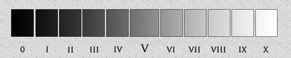
So when you hear someone refer to the "tonal range" of an image, they are referring to the number of the different zones that they are including in the image. The result should be a product of your intent. Sometimes a more narrow tonal range is preferred for the message you are trying to convey, and sometimes a broader tonal range is required.
These are just three of the things that I take into consideration every time that I put together an image. You should be thinking about them too.
These are just three of the things that I take into consideration every time that I put together an image. You should be thinking about them too.

No comments:
Post a Comment