
As Requested
Following a post last Saturday from a sunrise trip to Nubble Light in Maine, I received a couple of requests to see the original color image that I had made my conversion from. Color is the typical medium chosen for sunrises and lighthouses, so my black and white interpretation of the scene left people with questions about why I chose to render it the way I did. I promised a comparison and an explanation, and here it is.
First of all, the decision to use black and white as my medium of expression was not taken lightly. It's not something that I do to try to be "artsy" or "stylish". I use black and white because that is the way that I see things. It's not a random act of conversion, but all of my personal work that is done in shades of gray. I've been shooting in black and white for over 25 years, and continue to add to my understanding of why.
Photography is an art of contradictions. It’s Reality vs. Illusion, except it’s really only the perception of reality and all illusion. While photographs are based in reality, they are illusions. They are two dimensional representations of three dimensional subjects. When photographers shoot in color, it is always a struggle to attempt to accurately render the colors as the photographer understood them. Different films represented different colors in different ways. If three different color films all look different, is it possible that they could all be “reality”? If those same three different color films all represented the reds or greens in a particular image differently, they are all manipulating their reality differently, therefore creating an illusion of reality. The simple act of using black and white film is the manipulation of reality. The world does not actually appear in shades of gray, or does it? I prefer to be up front about my manipulation of reality, and convey my thoughts and impressions in black, white, and gray. Black and white imagery forces both the photographer and the viewer to work harder to understand an image. The artist has to work harder because he’s not going to be able to distract or lead the viewer through the use of color, and the viewer has to work harder as well since they are going to have to be looking at subtleties such as texture, shapes, tonal range and contrast.
That being said, here are the two images to compare. Now, it's important to remember that in order to end up with a properly converted black and white image, you need to start with a properly adjusted color image. Never shoot in "black and white" mode in your camera or you'll lose much of the flexibility and creativity that you'll have when starting with a color image.
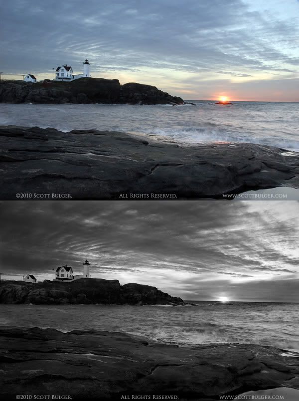
It was dark, cold, and very windy that morning, and I wanted to convey those feelings. How many times do you come across an eye popping scene? I mean something that you really stop to look at and just stand there awestruck? You get out your camera, bring it up to your eye, and depress the shutter...Hey! that image is really lacking the impact of the scene here that I am staring at....
Your eyes see differently than a camera. They have a different field of view, and they react to the light differently, so you need to be more than just a shutter snapper. You need to be an ARTIST. One of the skills you need to exercise is being a translator. You need to translate the scene for the photograph. There are many other senses involved in what you see than just your eyes.
What you hear, what you feel, what you taste, and what you smell all go into the overall presentation of what you are seeing. "How is that possible?" you might be thinking. Bear with me here. I'm going to exaggerate for effect.
You are at the seaside, and witness a beautiful scene of some flowers on a dune. It's incredibly beautiful to you at the moment and worth capturing to your CCD or film. Wait. Think for a second. What else is making the scene so darn "scenic" to you? You smell the salt air.You feel the ocean breeze on your face. You feel the sand compressing under your feet. You hear some gulls squawking as they ride the breezes overhead.You taste the salt in the air. All of these things are contributing to how you feel about what you are seeing.
Now what you need to do is translate this feeling to your image. Have you ever wondered why some images that appear to have such great potential look so "sterile"? No feeling. No passion. No vision. No heart. They just don't stir anything inside of you. Lousy translation.
Your next question is "OK Mr. Smarty Pants, how do I do this "translation" thingy you are talking about?"
I'm not telling you. I'm not telling you because I can't tell you. I don't know what you are feeling and seeing and hearing at these moments of epiphany. Only you know that. It's your job to tell me.
You're the artist, so art.
You need to be more than just a mechanic.
3 comments:
Scott, wonderful post. Masterful. Thank you so much. Sometimes when I am shooting I see the image in black and white.
Scott,
Removing the warmth of the rising sun definitely gives the image a more foreboding and colder look.
I'm not one for tinting B&W photos but in this case I think an ice-blue tint color would add to that feeling of cold. Even so, if it were my photo, I'd probably stick with the B&W.
I expected the color image to have a more vibrant sky. It does look cold. The black and white conveys that well. Great explanation of your craft. I am learning many things from your words.
I think I took a page from your book with a recent black and white shot I posted. The color image was flat and uninspired, but in black & white, it came out a bit eerie and cold.
Post a Comment